scale(0.100000,-0.100000)'%0Afill='%23129ad5' stroke='none'%3E%3Cpath d='M5395 4211 c-73 -34 -105 -85 -105 -171 0 -27 5 -61 11 -77 44 -117%0A229 -151 327 -60 38 35 55 78 55 137 0 59 -17 102 -55 137 -57 53 -159 68%0A-233 34z'/%3E%3Cpath d='M1582 3438 c3 -870 0 -822 70 -895 52 -53 112 -68 273 -68 77 1 148%0A4 158 8 15 6 17 22 17 132 l0 125 -34 0 c-26 0 -83 14 -98 23 -2 1 -5 328 -8%0A727 l-5 725 -188 3 -188 2 3 -782z'/%3E%3Cpath d='M701 3765 c-107 -24 -150 -51 -203 -129 l-48 -70 0 92 0 92 -185 0%0A-185 0 0 -860 0 -860 185 0 185 0 2 307 3 307 38 -62 c33 -54 44 -63 92 -81%0A130 -49 302 -52 431 -8 141 48 253 147 323 287 57 115 76 207 76 370 -1 153%0A-21 247 -78 355 -40 77 -146 182 -219 217 -115 56 -277 73 -417 43z m165 -276%0Ac57 -30 103 -86 135 -166 21 -51 23 -75 23 -203 0 -160 -13 -214 -73 -296%0A-116 -157 -382 -125 -460 57 -50 114 -51 358 -3 470 36 82 99 140 177 160 57%0A15 149 5 201 -22z'/%3E%3Cpath d='M4102 3760 c-213 -57 -352 -204 -413 -435 -28 -106 -31 -301 -6 -395%0A73 -276 272 -431 553 -432 103 -1 175 13 250 48 41 20 61 38 98 91 l46 67 0%0A-75 c0 -196 -41 -282 -160 -337 -47 -22 -69 -26 -150 -26 -148 1 -227 43 -254%0A135 l-13 44 -179 0 -179 0 3 -40 c9 -103 65 -211 148 -284 122 -107 355 -159%0A588 -131 286 34 451 151 533 377 37 102 44 247 41 838 l-3 540 -187 3 -188 2%0A0 -76 0 -76 -42 64 c-41 60 -47 64 -113 87 -100 34 -271 39 -373 11z m363%0A-266 c57 -27 111 -87 137 -152 19 -50 22 -75 22 -197 0 -119 -3 -149 -22 -199%0A-44 -119 -115 -175 -233 -184 -100 -7 -153 11 -215 73 -79 79 -98 137 -98 305%0A0 118 3 142 24 195 49 124 149 189 280 182 36 -2 83 -12 105 -23z'/%3E%3Cpath d='M6550 3762 c-92 -24 -129 -49 -180 -123 l-45 -64 -5 85 -5 85 -187 3%0A-188 2 0 -630 0 -630 188 2 187 3 5 385 c5 353 8 390 26 446 34 101 82 158%0A153 182 111 38 239 -20 271 -123 10 -29 14 -159 16 -481 2 -408 4 -445 22%0A-497 66 -187 262 -314 452 -293 116 13 197 53 276 138 105 111 118 162 115%0A451 l-2 228 30 29 c35 36 70 38 106 7 21 -18 28 -35 35 -87 4 -36 14 -84 22%0A-107 56 -158 206 -276 368 -290 l67 -6 13 -51 c18 -75 82 -204 135 -274 62%0A-82 168 -178 256 -230 208 -125 537 -160 723 -78 102 45 207 168 235 274 l12%0A42 100 0 c138 0 190 23 230 102 40 79 10 181 -68 229 -34 20 -50 22 -150 21%0Al-113 -2 -1 128 c0 70 -1 146 -3 170 -2 39 0 42 23 43 68 1 179 9 200 15 71%0A16 114 79 114 166 0 45 -5 65 -27 98 -42 64 -92 82 -223 79 l-106 -2 -14 43%0Ac-43 127 -153 233 -284 274 -112 34 -365 19 -504 -32 -263 -95 -477 -329 -540%0A-590 l-18 -74 -31 6 c-39 8 -66 39 -66 77 0 133 -84 283 -202 359 -221 143%0A-517 57 -630 -184 l-33 -71 -5 -255 c-3 -140 -9 -261 -13 -267 -12 -20 -69%0A-31 -99 -20 l-28 9 0 446 c0 265 -4 474 -11 512 -28 174 -131 285 -301 325%0A-83 19 -217 18 -298 -3z m2771 -430 c48 -25 119 -98 119 -123 0 -5 -39 -9 -87%0A-9 -131 -1 -184 -25 -219 -98 -33 -69 -17 -158 38 -209 38 -36 77 -45 191 -44%0Al107 1 0 -170 0 -170 -52 -1 c-173 -3 -207 -13 -255 -76 -24 -31 -28 -46 -28%0A-103 0 -58 4 -71 29 -104 43 -57 98 -77 201 -75 47 1 88 0 90 -3 2 -2 -10 -26%0A-28 -53 -21 -32 -50 -58 -86 -79 -140 -78 -323 -3 -366 149 -10 36 -15 148%0A-19 405 -9 504 -9 561 -1 600 13 68 104 166 171 183 10 2 47 5 80 6 50 1 72%0A-5 115 -27z'/%3E%3Cpath d='M2257 3743 c-10 -10 -8 -782 3 -897 11 -123 46 -203 120 -269 113%0A-102 298 -142 469 -102 107 26 149 55 204 143 l47 77 0 -103 0 -102 188 2 187%0A3 0 625 0 625 -187 3 -187 2 -3 -402 c-3 -386 -4 -405 -25 -456 -48 -118 -112%0A-165 -224 -164 -105 0 -163 39 -200 132 -10 27 -14 133 -17 463 l-3 427 -183%0A0 c-100 0 -186 -3 -189 -7z'/%3E%3Cpath d='M5300 3120 l0 -630 185 0 185 0 0 630 0 630 -185 0 -185 0 0 -630z'/%3E%3C/g%3E%3Cg transform='translate(0.000000,423.000000) scale(0.100000,-0.100000)'%0Afill='%23434343' stroke='none'%3E%3Cpath d='M432 1650 c-162 -43 -298 -151 -365 -290 -50 -105 -67 -184 -67 -321%0A0 -320 157 -537 432 -595 96 -21 267 -14 358 15 70 22 168 76 214 119 46 43%0A105 140 126 210 34 111 46 103 -151 100 l-170 -3 -24 -59 c-44 -109 -108 -152%0A-215 -144 -144 10 -218 156 -207 408 6 141 25 203 77 262 51 59 83 71 168 66%0A57 -3 76 -9 106 -31 40 -31 72 -86 84 -144 l8 -38 172 -3 172 -2 0 29 c0 51%0A-39 157 -81 221 -66 98 -190 178 -318 206 -93 19 -231 17 -319 -6z'/%3E%3Cpath d='M1730 1654 c-164 -35 -312 -149 -383 -294 -46 -93 -67 -188 -67 -308%0A0 -293 142 -505 394 -589 73 -24 95 -27 226 -27 131 0 153 3 226 27 153 51%0A264 146 330 283 89 186 86 441 -7 625 -68 136 -223 250 -384 284 -87 18 -249%0A18 -335 -1z m302 -269 c94 -67 144 -242 119 -423 -15 -104 -45 -175 -96 -225%0A-48 -47 -91 -60 -175 -55 -57 3 -76 9 -112 34 -141 102 -172 452 -53 615 49%0A68 101 91 197 87 66 -3 82 -7 120 -33z'/%3E%3Cpath d='M3217 1651 c-82 -27 -101 -42 -146 -118 l-41 -68 0 88 0 87 -175 0%0A-175 0 0 -590 0 -590 174 0 174 0 4 378 c4 353 6 381 26 443 17 51 32 76 63%0A104 41 37 42 37 115 33 68 -3 76 -6 109 -38 62 -60 65 -84 65 -527 l0 -393%0A180 0 180 0 0 363 c0 288 3 375 15 426 30 125 79 171 181 171 47 0 69 -5 94%0A-23 81 -54 90 -111 90 -579 l0 -358 175 0 176 0 -3 468 c-4 521 -2 510 -76%0A607 -29 38 -56 59 -116 90 l-79 40 -126 0 c-117 0 -130 -2 -187 -28 -53 -25%0A-69 -40 -119 -108 l-59 -79 -27 49 c-36 63 -98 115 -168 143 -80 31 -243 35%0A-324 9z'/%3E%3Cpath d='M5310 1652 c-91 -24 -129 -49 -175 -116 l-40 -58 -3 81 -3 81 -174 0%0A-175 0 0 -805 0 -805 175 0 175 0 2 287 3 287 34 -56 c28 -45 44 -61 81 -77%0A69 -30 173 -44 269 -38 239 15 415 160 491 402 31 96 38 299 16 405 -45 212%0A-183 366 -371 415 -78 20 -223 18 -305 -3z m189 -265 c90 -59 135 -174 135%0A-337 0 -122 -17 -193 -66 -266 -92 -135 -312 -141 -408 -11 -48 65 -64 134%0A-63 272 0 195 43 298 145 350 47 23 63 26 134 23 68 -3 87 -7 123 -31z'/%3E%3Cpath d='M6494 1650 c-189 -49 -314 -169 -344 -331 -6 -29 -10 -58 -10 -65 0%0A-11 33 -14 169 -14 l169 0 7 37 c9 48 27 82 60 113 21 20 39 25 94 28 120 7%0A171 -40 171 -159 l0 -66 -117 -7 c-199 -12 -325 -45 -428 -111 -68 -44 -99%0A-79 -132 -150 -24 -52 -28 -72 -28 -150 0 -78 4 -97 28 -147 35 -72 110 -140%0A185 -169 118 -44 294 -34 410 25 40 20 52 33 66 70 10 26 21 44 26 41 4 -3 11%0A-34 15 -70 l7 -65 175 0 175 0 -6 28 c-4 15 -11 211 -16 437 -5 234 -13 429%0A-19 453 -38 147 -145 243 -310 278 -94 20 -260 17 -347 -6z m300 -680 c16 0%0A18 -8 15 -83 -3 -71 -8 -90 -32 -125 -36 -55 -90 -82 -165 -82 -75 0 -121 28%0A-140 85 -23 70 9 139 82 174 45 22 162 42 201 35 11 -2 28 -4 39 -4z'/%3E%3Cpath d='M8030 1659 c-19 -5 -60 -21 -90 -35 -46 -21 -63 -36 -95 -87 l-40%0A-61 -3 82 -3 82 -179 0 -180 0 0 -590 0 -590 180 0 180 0 0 333 c0 365 7 427%0A57 519 42 78 81 102 169 106 65 4 79 1 118 -22 31 -18 51 -40 68 -73 23 -48%0A23 -51 26 -455 l4 -408 174 0 175 0 -3 453 c-4 496 -5 501 -67 599 -36 56 -92%0A99 -170 129 -43 17 -83 23 -171 25 -63 2 -131 -1 -150 -7z'/%3E%3Cpath d='M8690 1633 c0 -5 108 -280 239 -613 235 -597 238 -605 224 -639 -39%0A-99 -98 -135 -220 -136 l-83 0 0 -117 0 -118 25 -6 c47 -12 267 2 315 20 109%0A40 195 128 268 271 27 54 532 1327 532 1342 0 1 -87 3 -192 3 l-193 0 -79%0A-273 c-44 -149 -103 -350 -131 -445 l-51 -174 -112 379 c-62 208 -121 408%0A-133 446 l-20 67 -194 0 c-107 0 -195 -3 -195 -7z'/%3E%3C/g%3E%3C/svg%3E%0A)
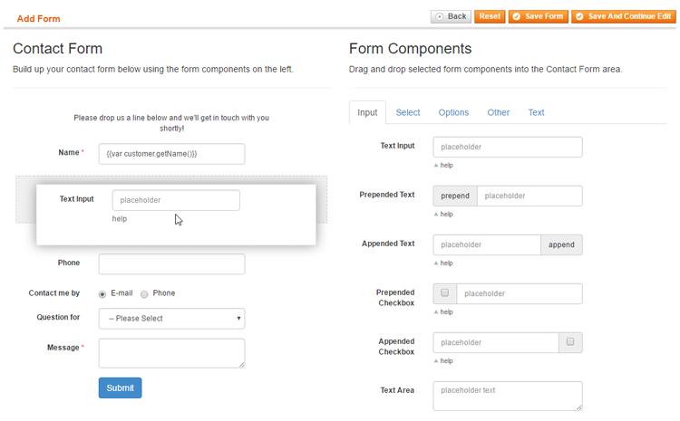
Form Builder
In the Form Builder interface you can build up your contact form by selecting form components on the right side of the page and dragging and dropping them in the Contact Form area on the left.
When creating a new form, a default contact form will be shown in the Contact Form area which can be used as a starting point. If you prefer to start from scratch, you can remove individual components by dragging them out of the Contact Form area.
Form Components
The form components are categorized in the five tabs on the right side of the Form Builder.
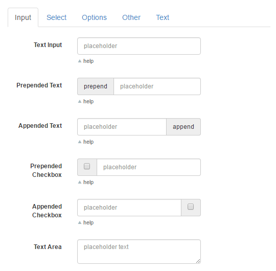
The Input tab contains various text input fields, including fields with a prepended / appended text or checkbox.
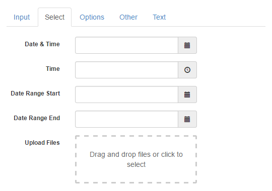
The Select tab includes fields for selecting dates, date ranges, time and files. With the upload component, files can be selected or dragged and dropped into the upload field.
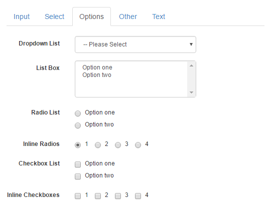
The Options tab provides various fields for selecting one or multiple options. The dropdown menu and radio buttons can be used if only one out of several options should be chosen, while the list box and the checkboxes allow multiple selections.
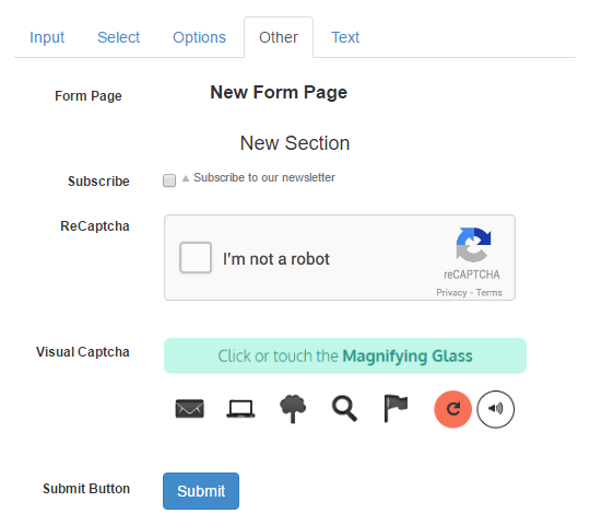
The Other tab contains a Form Page and Form Section component, a newsletter subscription checkbox, a submit button and two different Captcha functionalities: Google ReCaptcha and Visual Captcha. Please note that ReCaptcha will only work if it’s enabled in the extension’s General Settings.
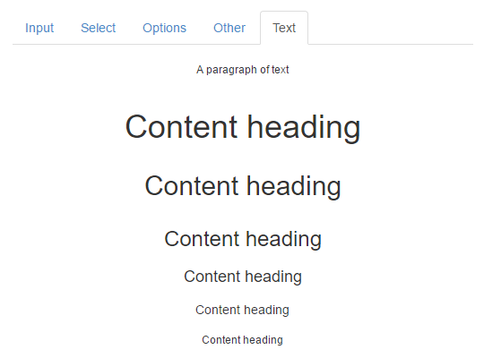
The Text tab components can be used to add paragraphs and content headings to the contact form.
Adding and Moving Form Components
Selected form components can be added to the form and rearranged by dragging and dropping them in the Contact Form area. A grey block will appear when the component is hovering above a suitable space to be dropped.
Configuring Form Components
Once a form field is added to the contact form, you can configure its settings by selecting it. A pop-over will appear on the right showing the configuration options, which vary per component. You can find a short description of the most important form field settings below.
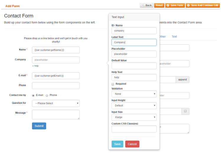
- The form field ID / Name serves as an identifier for admin reference and can also be used as a custom variable in the form’s customer notifications and admin notifications. To make sure all form data is submitted correctly, it’s important to assign a unique ID to each form component, without using any spaces. Best practice is to use short IDs that describe the content of the form component, such as name, email, department, contact-method, etc.
- The Label Text is displayed on the left side of each form component, a Placeholder can be shown inside input fields and a Help Text can be added below input and selection fields.
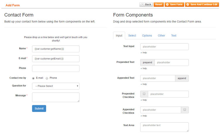
- You can optionally enter a Default Value for input fields, which also support automatically prefilled variables such as customer name, contact details and product attributes. In the default form, the ‘Name’ and ‘E-mail’ fields are automatically filled in for logged in customers using the variables {{var customer.getName()}} and {{var customer.getEmail()}}. If the specified variables are not found, the input fields remain empty. You can read all about configuring automatically prefilled form variables here.
- Most form components can be made Required, ensuring that a form cannot be submitted without providing the required data.
- The input fields include an optional Validation function which verifies if the input is entered using the correct format (e.g. a number, e-mail address, URL, date, etc).
- The option fields can be configured by entering a list of Options, Radios or Checkboxes, which can include a default/preselected value by adding a * in front of a specific option, for example *Option One.
- The input and selection components have an adjustable Input Size and Height.
- All form components can be further customized using the Custom CSS field in the Front-end Style tab by entering the Custom CSS Class(es) per form field.
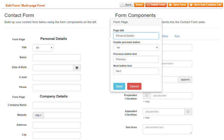
Creating Form Pages
The Form Page component in the Other tab can be used for dividing your form into multiple pages or tabs, which can be browsed through using the buttons at the bottom of each form page (see multi-page contact form example).
Once added to the contact form, each form page can be given a custom title which is shown in a navigation bar at the top of the contact form.
Please note that in order to modify the first form page title, you need to insert a form page component at the top of your contact form as exemplified below.
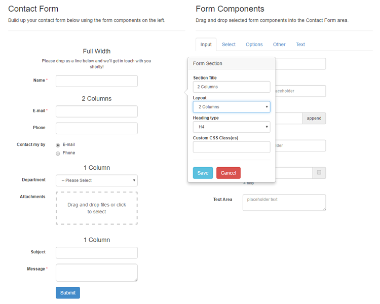
Creating Form Sections and Columns
A form can also be divided into multiple sections or columns using the Form Section component from the Other tab (see multi-column contact form example).
Once added to the contact form, you can select the Form Section component to configure its title, layout and heading type in a pop-over.
Using the ‘Layout’ dropdown menu, you can choose to add a Full Width, 1 Column or 2 Columns section to the contact form. The 2 Columns layout will evenly divide the fields within a section into two columns.